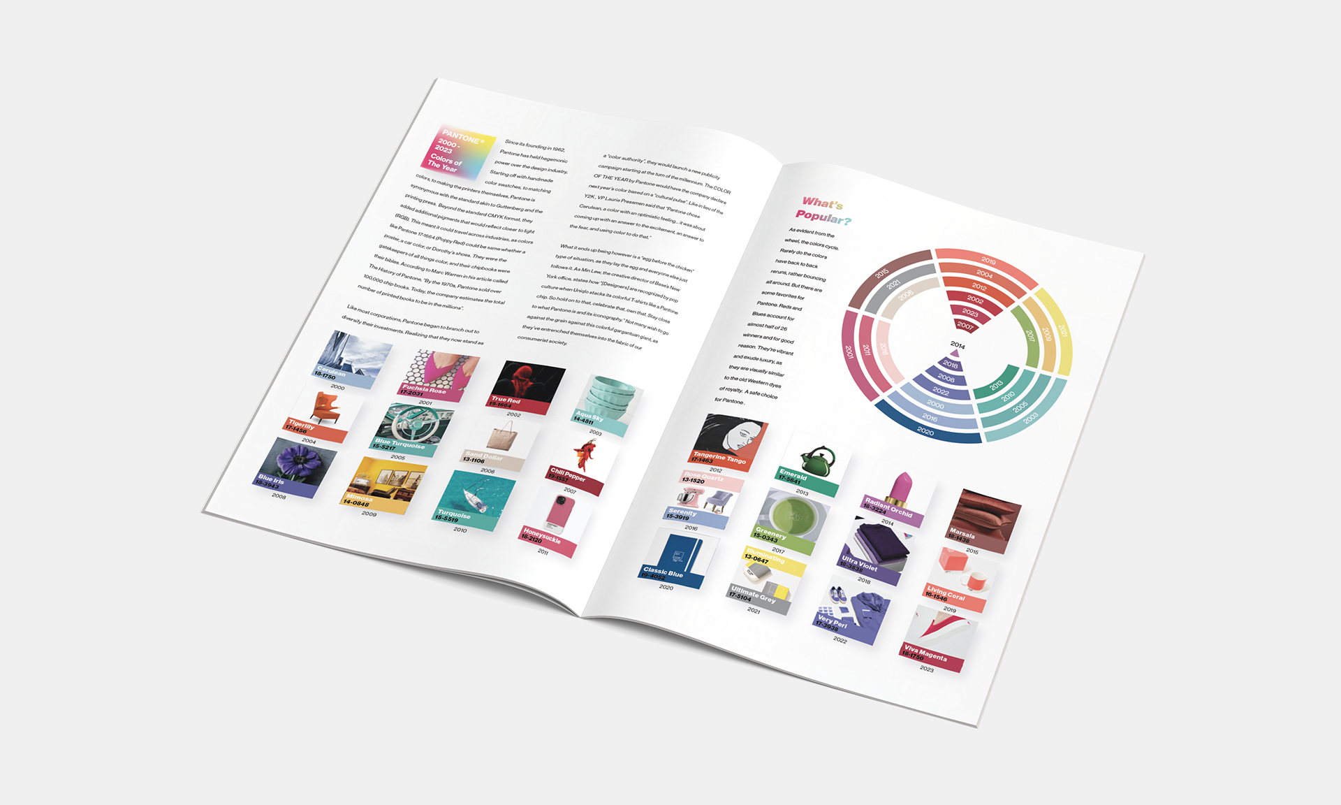
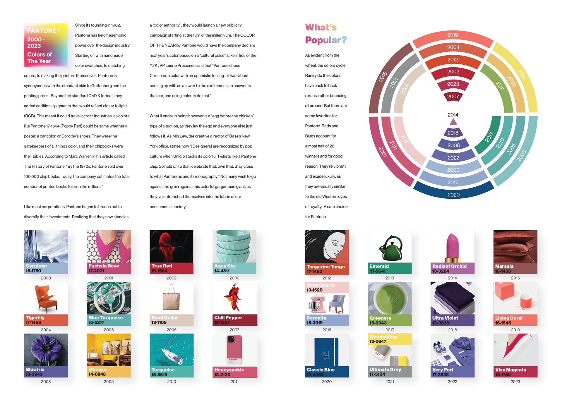

Tasked with creating a timeline data visualization for a magazine, I choose to analyze the last 26 winners of "Pantone's Color of the Year". Playful and professional, I used wide gutters and grid systems to make the information as disgustable as possible. But the pops of color and products add intrigue and enforces the notion that the awards are fundamentally rooted in consumerism. Not to mention how it incorporates the entire dataset in a fun and engaging way.